Hackathon: 24 hours
Team of 4 UX Designers & 3 Web Developers
(Adriana Wong, Jeremy Tang, Rachel Verdoorn, Yakuta Izzy, Chris Martin, Maria Galindo & Sasha Sirota)
Role: UX/UI Designer
UX Research
UI Branding
Sketching
Wireframing
Tools: Figma, FigJam
Project Overview

Robinhood was looking to engage new and existing users by sparking their curiosity around cryptocurrency and online trading.
Robinhood was seeking innovative ways to:
Educate users and demystify the world of cryptocurrency;
Leverage consumer behaviour information to better engage new/existing customers;
Illustrate why and how individuals can take control of their own finances;
Establish Robinhood as the preferred platform for crypto trading.
Problem Space
Research
1 Yahoo Finance, 2020
2 TIAA Institute, 2020
3 Business of Apps, 2021
Given our time restraints, we did not conduct primary research.
However, using existing information regarding the motivations, pain points and goals of Robinhood users, we created our proto-persona.
Proto-Persona
Sketching
From our research findings, we began to sketch out potential solutions. We discussed the most viable options, and collectively agreed upon our favourite elements from each sketch.
Here are the key features we showcased in our finalized sketch:
Use of a large Hero section, with big attention-grabbing Call To Action buttons;
Three large value propositions showing why users should invest in crypto with Robinhood;
Use of gamification to teach users crypto facts and information;
Use of cards to provide users with different ways of learning.
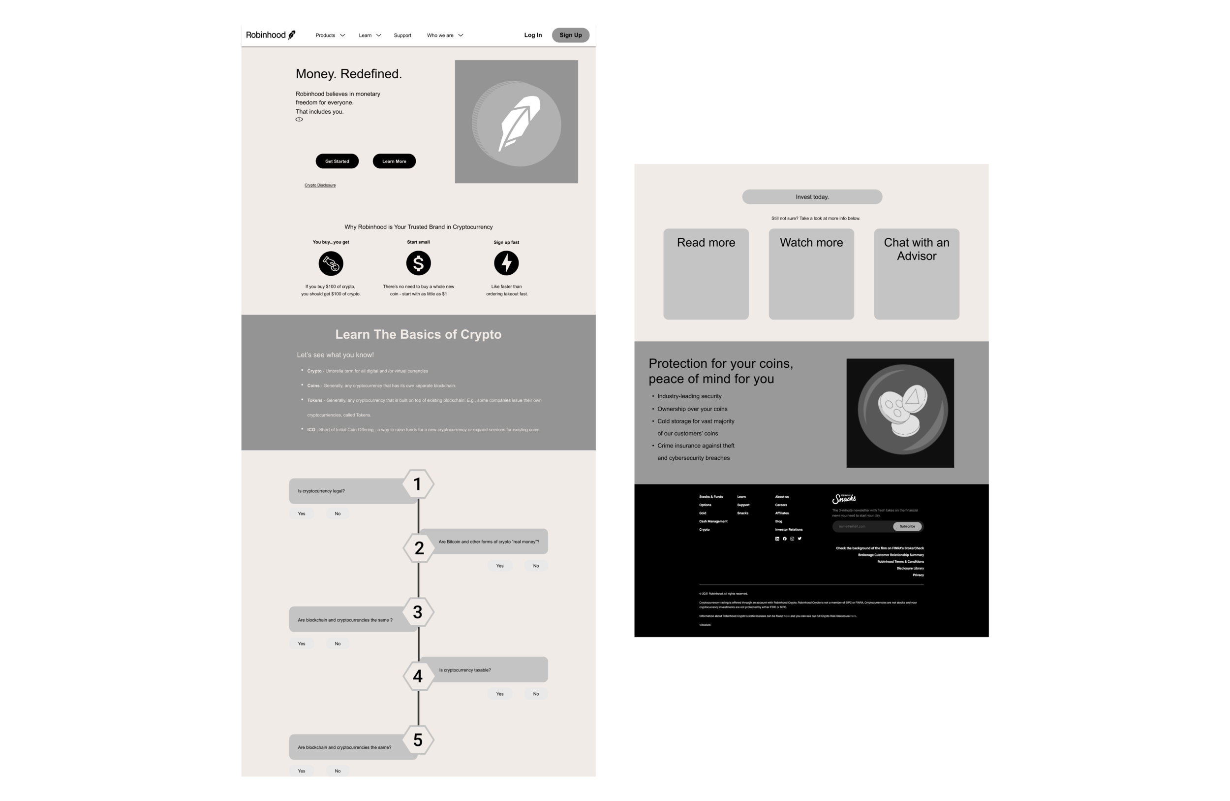
Using the solution sketch, we translated the elements into a mid-fidelity wireframe using Figma.
Throughout this process, the team of UX designers communicated with the team of Web Developers to ensure we were on the same page. At this point, we provided this wireframe to their team to reference during their coding.
Mid-Fi Wireframe
Through our research into Robinhood, we learnt that they utilized deep purples, neon yellows and pinks specifically for their cryptocurrency section.
To ensure consistency, we created a UI library of the brand colours, wordmarks, logos, font families, iconography, and illustrations.
Branding & UI
We knew it was vital to keep accessibility at the forefront. Prior to injecting UI elements into the wireframes, we conducted colour blindness checks and colour contrast checkers to ensure that it passed WCAG AA standards.
Accessibility
Colour Blindness Check
Given the high proportion of individuals that are affected by colour blindness, we ensured that the brand colours utilized were accessible.
Button Contrast
We conducted contrast checks between the background colour and the CTA buttons to ensure that they were easily distinguishable.
Banner Contrast
To ensure that the hero was clear and accessible to all users visiting the website, we tested all the components in the banner to ensure they passed accessibility standards.
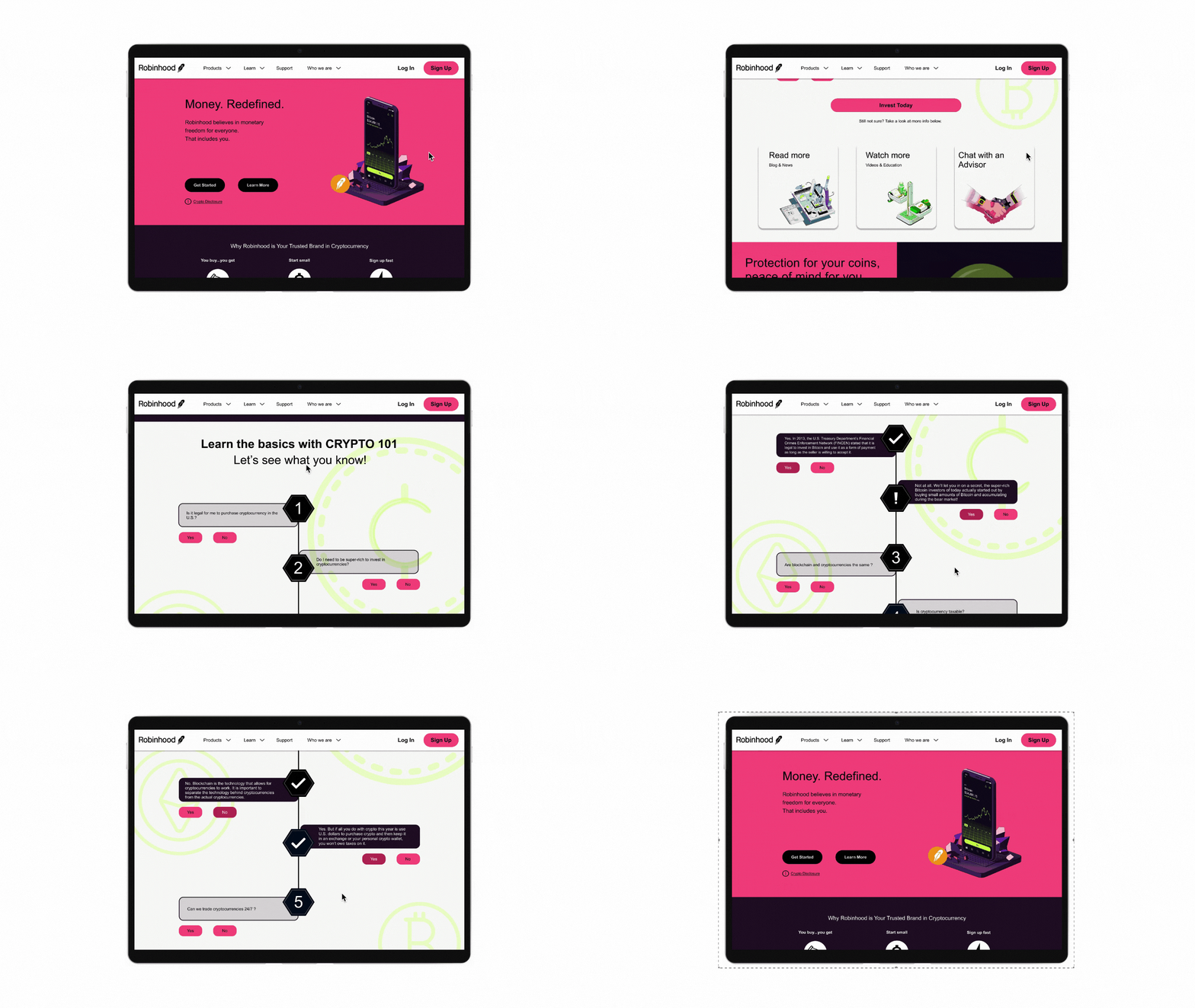
Using our mid-fidelity wireframes, UI and branding elements, we created our high-fidelity wireframe.
We continued to communicate with our Web Developers to ensure that our ideas were clear and feasible in 24 hours. We provided property details such as positioning, pixels, PNG and SVG files whenever possible.
Hi-Fi Prototype
Interact with Prototype
Communicate, communicate, communicate
Being in a team of UX designers and Web Developers, it was crucial to communicate ideas and ensure everyone was on the same page especially during hand-offs;
Organize
Organization was key to ensuring everyone was involved and there was consistency across the board;
Play off of your strengths
As a team, we expressed our strengths and weaknesses to ensure we were able to produce the most succinct project that showcased what we excelled at.
Key Learnings


