
What do donors need to trust a non-profit organization?
PROJECT OVERVIEW
Improving organization perception & increasing conversions.
As part of a 5-day Design Sprint, we were tasked with redesigning an end-to-end product for an existing non-profit NGO by extending their reach, grow support and drive impact on a pressing social issue.
Nellie’s is a local organization that provides shelter, education and advocacy for women and children facing violence, poverty or homelessness.
OBJECTIVE:
Provide a digital solution to improve the organization’s perception in order to increase charitable donations to Nellie’s.
CONSTRAINTS:
📌 Existing brand guidelines
📌 Timeframe of 5 days
My Role
UX Researcher, UX/UI Designer
Tools
Figma, FigJam, InVision, Pitch
Duration
5 Days
Team
5 UX Designers (Adriana Wong, Elizabeth Chen, Lyn Li, Rachel Verdoorn, Samantha Llorente)
PROCESS OVERVIEW


Problem Space
As a starting point, we delved into research surrounding:
Violence against women shelters in Canada;
Shelter organizations in Canada;
Perceptions surrounding charitable organizations;
Nellie’s current website.
For many Canadian households, giving to charitable organizations has always been an important value.
Current Research
20 individuals are abused by an intimate partner every minute (The National Center for Injury, Disease Control and Prevention, 2011);
19,000 women are turned away from shelters due to a lack of space (CBC News, 2020);
48% of people have low confidence in charities (BBB Wise Giving Alliance, 2018).

Primary Research
To turn this problem space into an effective and actionable design challenge, we conducted 5 user interviews to understand the motivations, behaviours and pain points of individuals.
During analysis of the interviews, we noticed key themes emerging from individual’s experiences with donating:
a lack of financial transparency, not knowing how the money was spent;
the overall negative experience of donating.
With this firsthand knowledge, our goal for our design sprint was to build trust so that people feel confident that their donations are going to make a difference.
Website Audit
After understanding key points of concerns among users, we evaluated how effective the current website was at informing visitors. Using Jakob Neilsen’s heuristic evaluation, we examined the interface and judge its compliance with recognized usability principles.
Looking into Nellie’s, there is undoubtedly many avenues through which they are creating positive change. However, since their donation flow is not straightforward and intuitive, many well-meaning individuals were leaving the website without donating.

Persona
From our interview insights, we created our persona, Corinne Taylor.
A 35 year-old pediatric nurse who represented the demographic of individuals who want to give financially to her community. However, due to the lack of transparency surrounding funds, finds the current donation process untrustworthy and invalidating.

Experience Mapping
To further our understanding, we plotted an experience map to showcase the phases that a donor goes through from initially deciding to support a charitable organization to exiting the website having not donated.
This mapping was also helpful in determining opportunities of intervention.


With our insights and research findings, we collectively discussed crucial elements to be included on the home and donation page.
Being mindful of user needs as well as adhering to existing branding, we individually created sketches, then presented our work and anonymously dot-voted for key features that were compiled to create our solution sketch.
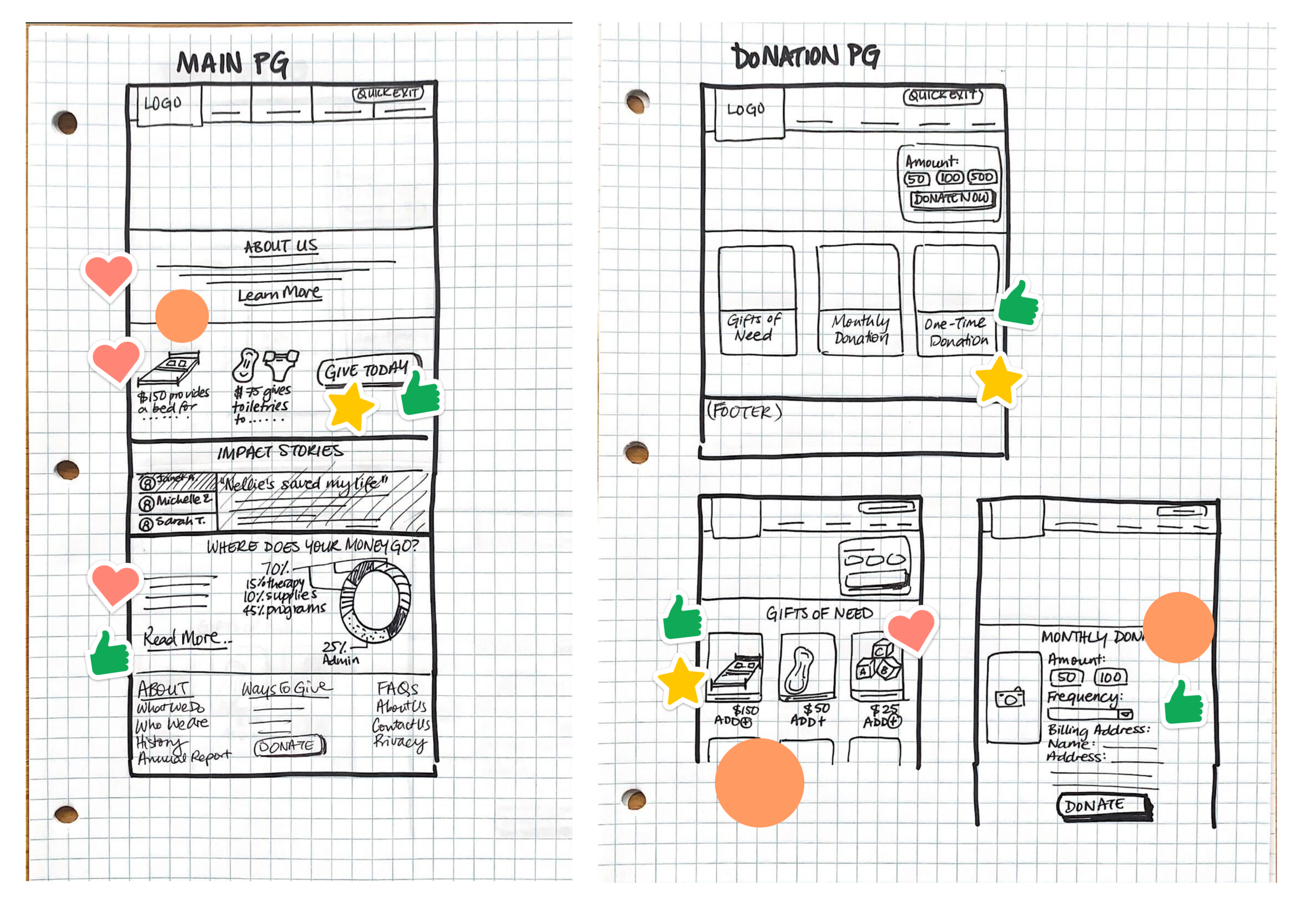
Sketches that I created, while the stickers are from group members during dot-voting.
Solution sketch that informed our initial low-fidelity wireframes.

DESIGN DECISIONS
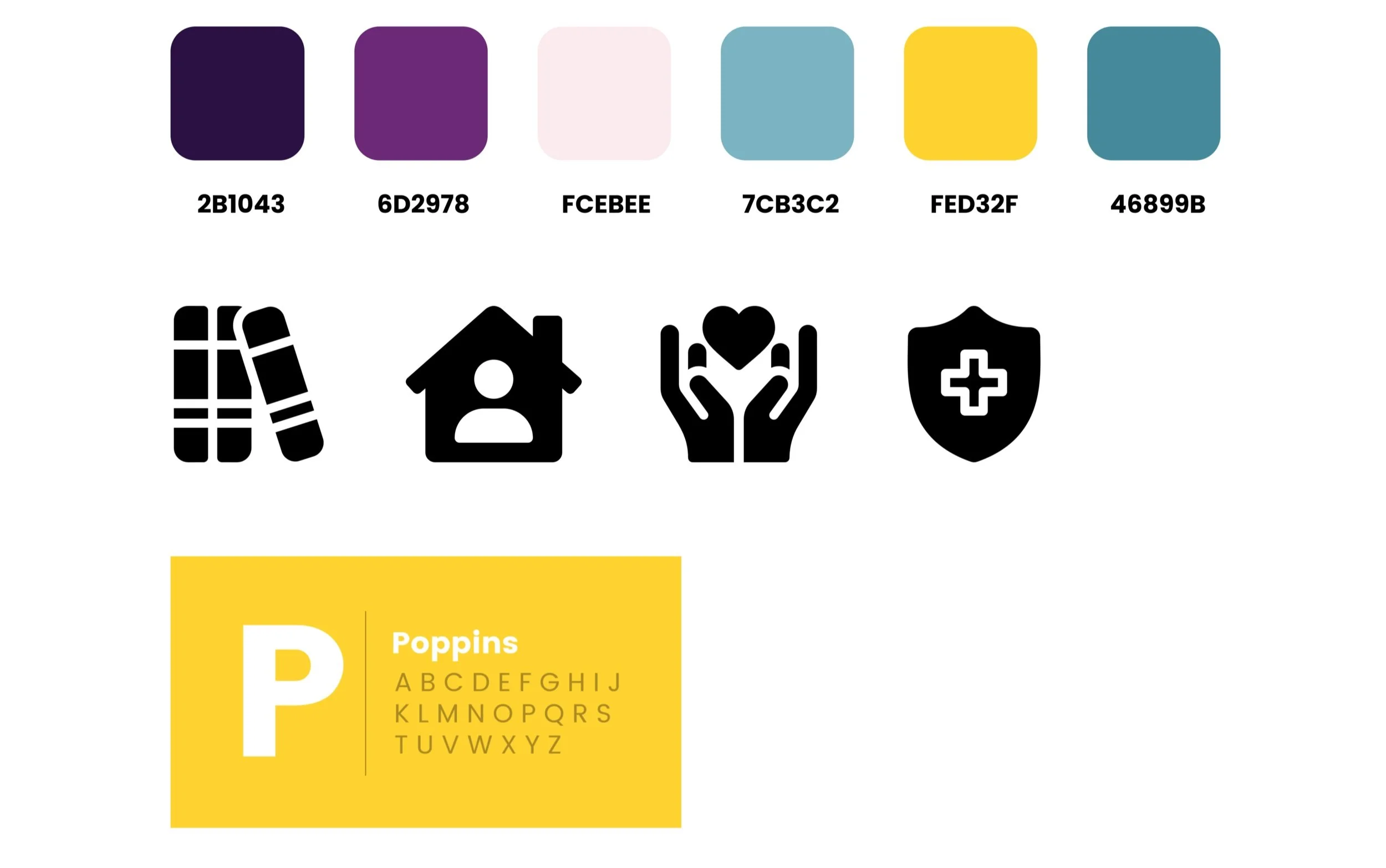
Adhering to Nellie’s original site branding, we chose a colour palette of purple, turquoise, and cadmium yellow. These colours foster a feeling of hope and trust that aligns with our persona's needs.
We made sure our UI was clean and easy to navigate as we wanted to maintain and enhance our users' confidence throughout their experience on the site. We rendered our elements flat with rounded corners, added lots of icons, and used the pleasing geometric font Poppins to make our flow easy for the eyes to process information.
ACCESSIBILITY & BEST PRACTICES
To ensure the website was accessible for all our users, we went through a meticulous process to ensure all our colour combinations passed the colour accessibility test and included an accessibility toggle with options for contrast, enlarge texts, and change language.
We also had a quick-exit button fixed on our header for users (victims of domestic violence) who may need to leave our site quickly if they were in danger.

VERSION 1 PROTOTYPE
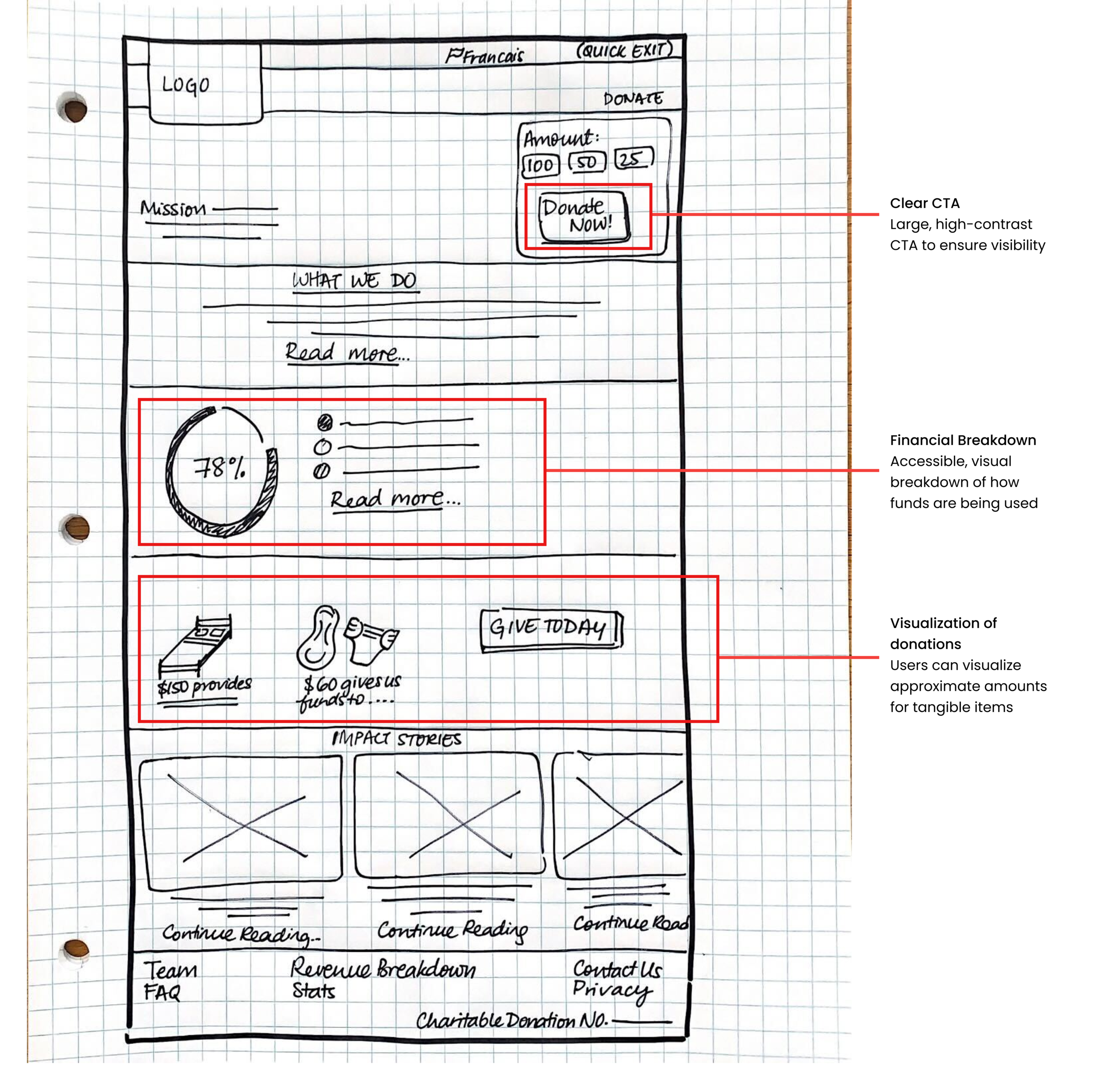
Using our solution sketches and design elements, we began developing our version 1 wireframes, keeping in mind the various user needs including financial transparency, direct impact of their funding, and a clear donation form.
Given the time restraints and to avoid detraction from testing the usability of the features, we decided to use a grayscale prototype for user testing.


At this point, we conducted 5 usability tests using our version 1 prototype and evaluated how users would navigate learning about the organization and donating.
Below is a summary of our test results and design prioritization matrix that we used to prioritize the feedback received.
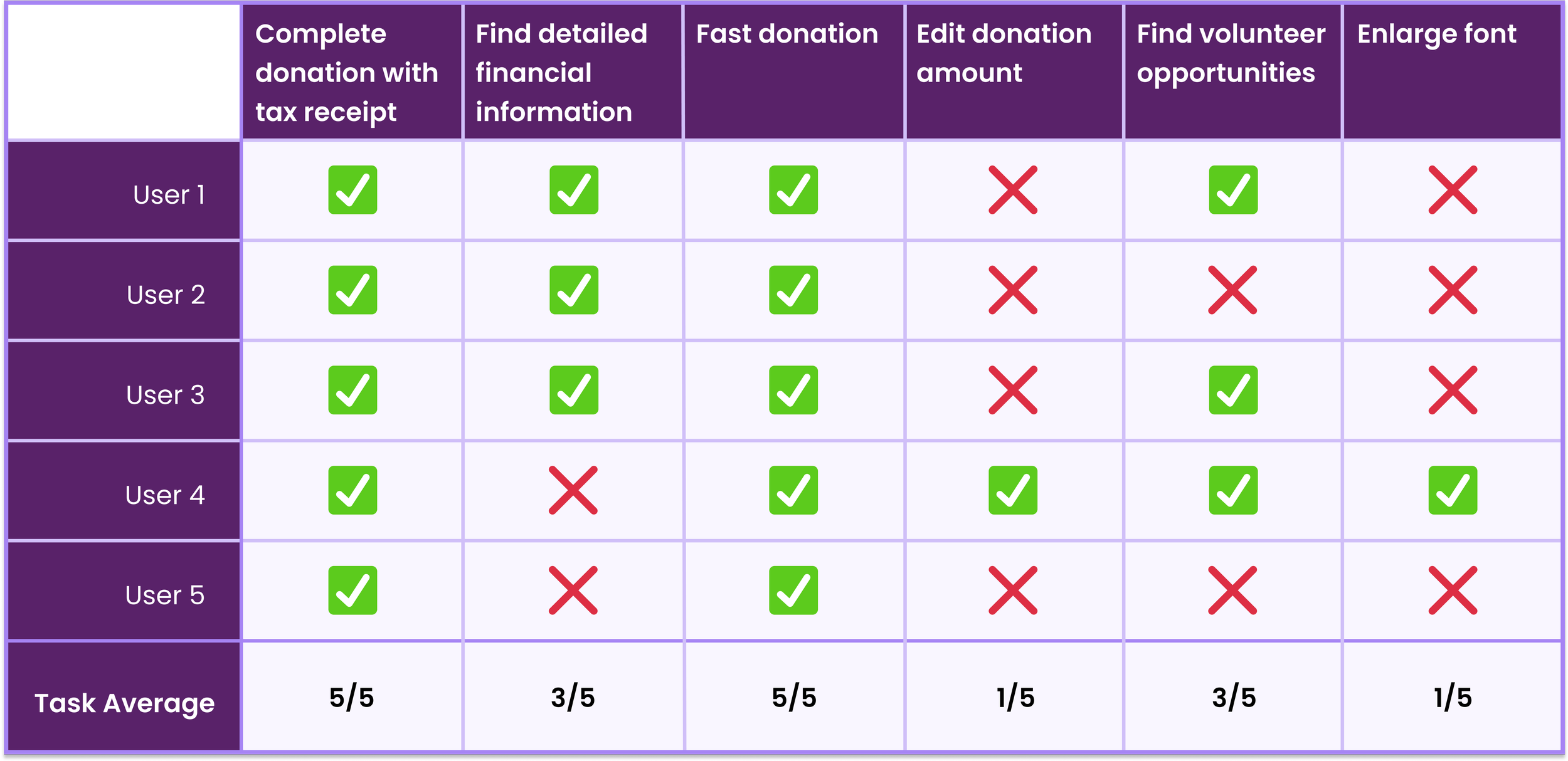
User Testing Output
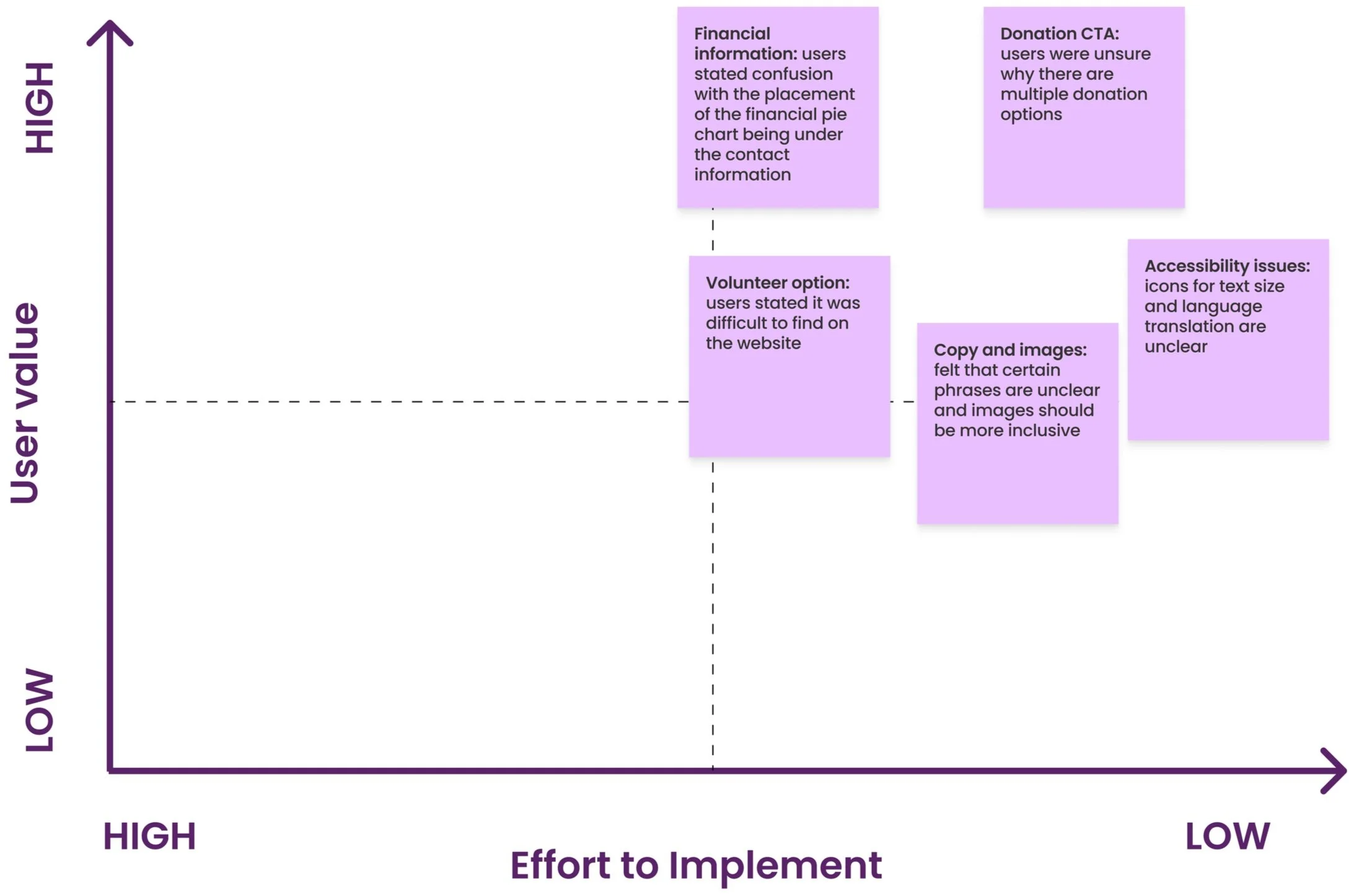
Design Prioritization Matrix of changes that were implemented
With only a few design elements to improve on, we plotted a design prioritization matrix to see the relation between value to the user and the effort on the UX team. We implemented all changes as they were manageable within our time frame.


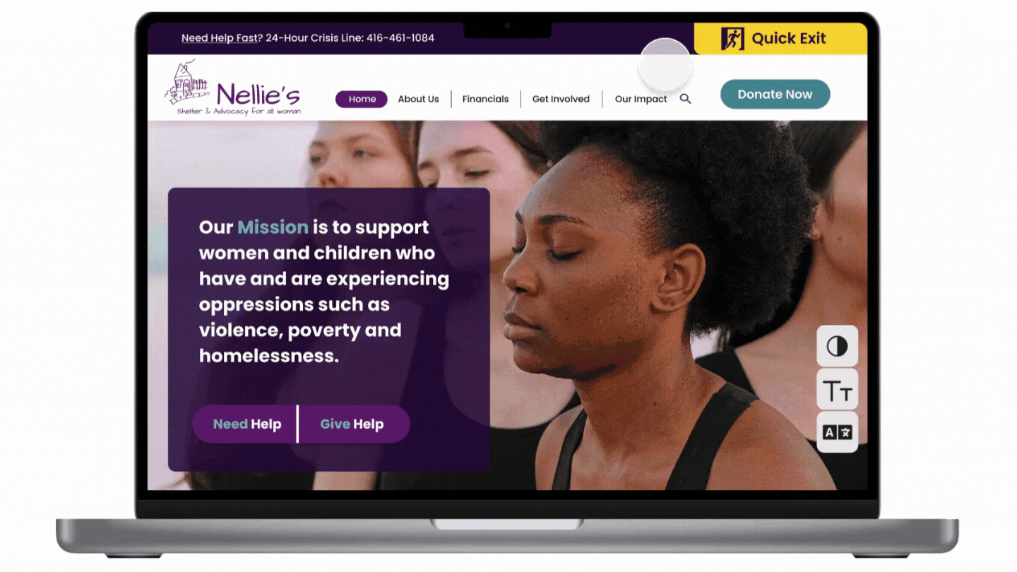
Final Prototype

Key Takeaways
Communication is key.
To ensure our team was effective given our time constraints, it was crucial to define our individual roles and responsibilities right from the get-go. It was important for us to complete tasks individually but also ensuring we created space to collaborate as a team.
There is power in asking the right questions.
I learnt the importance of crafting the right questions during user interviews that helped us dig deep - move beyond what users are saying, and instead, focusing on what they are doing.