Project Overview
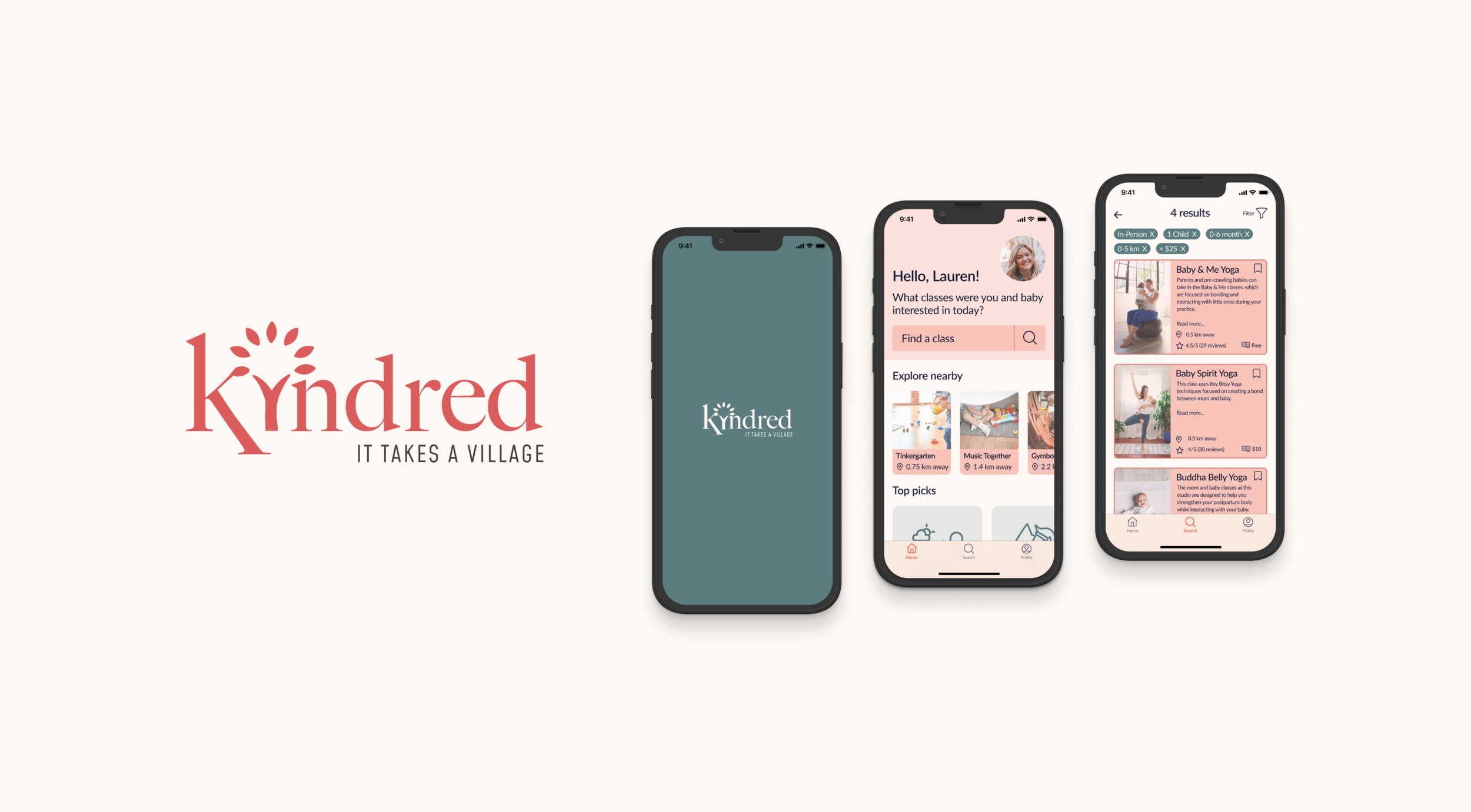
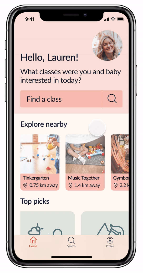
Kindred is an app that encourages first-time parents to find local programs of interest. Kindred allows users to search for classes, explore top picks, and share reviews.
GOAL
A digital platform that allows users to connect with their community.
Encourage social connection for parents.
Academic Project
BrainStation Diploma - Capstone
Timeline
8-week duration (Sept-Dec 2021)
My Role
UX/UI Designer
Tools
Figma
InVision
Method
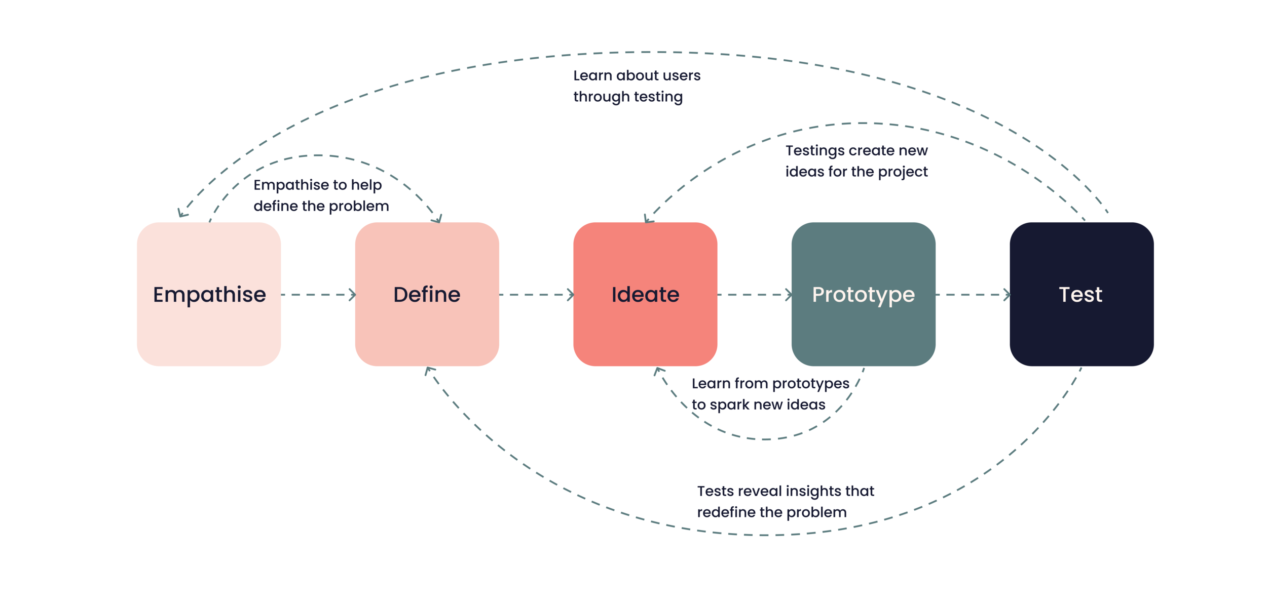
My design process utilized the Design Thinking process, as it provided a human-centred framework for problem-solving.

EMPATHISE
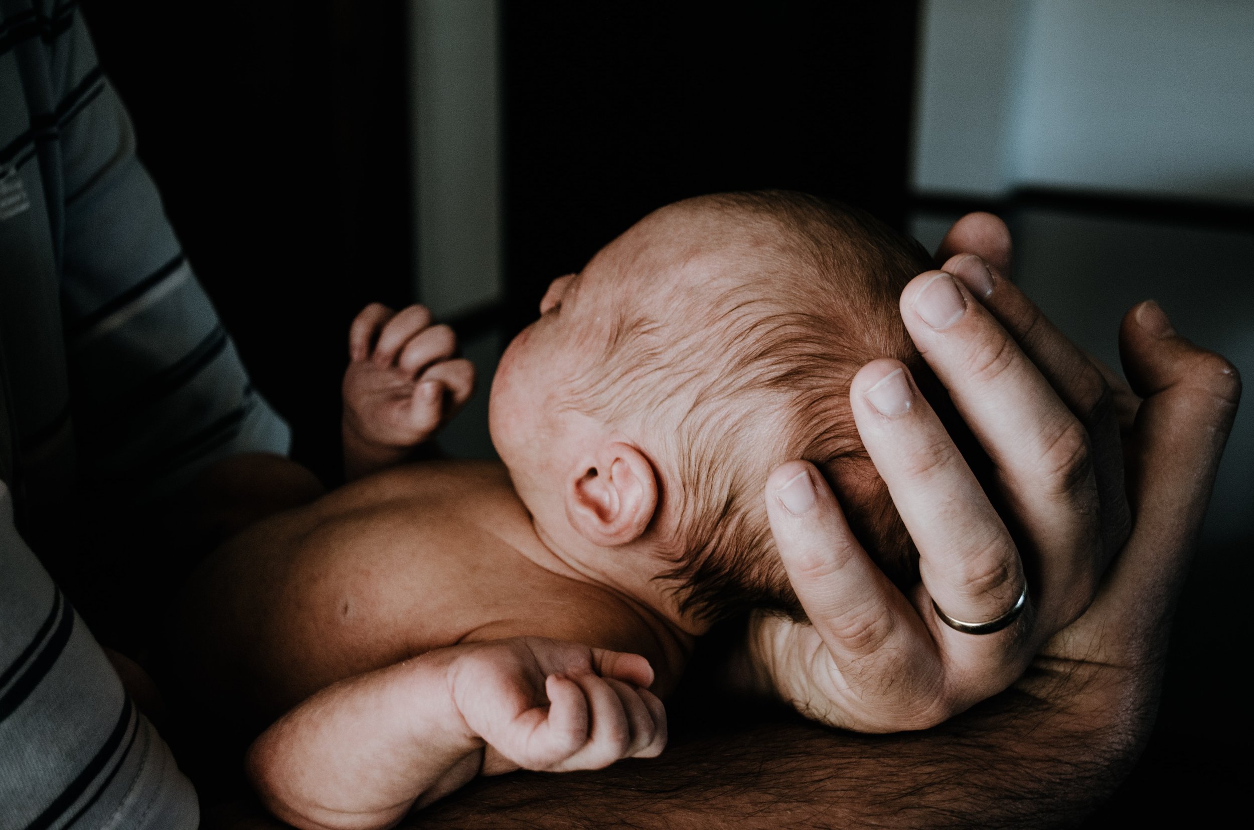
A deep desire for connection and engagement…
Problem Space
Secondary Research
Isolation
68% of mothers felt “cut off” from friends, colleagues, and family after the birth of a child.

Loneliness
92% of mothers have felt lonely since having children.

Maternal Confidence
First-time mothers showed lower levels of maternal confidence and higher levels of stress than multiparous* mothers.
* Multiparous refers to mothers of multiple children.
Primary Research
With foundational research of the problem space, I conducted five 1-on-1 interviews to delve further into the lived experiences of first-time parents. I wanted to understand their pain points, motivations and goals. I did this through generalized open-ended and specific questions.
Through conducting this research, I uncovered 4 Key Themes & Insights.

1. Support from Family, Friends and Healthcare Providers
Interviewees attributed feeling supported and more confident to their social support system.
“I feel truly blessed having the support of my in-laws and parents to watch the baby for a bit if needed as it can be draining being with baby all the time”
2. Connecting with Community
Interviewees expressed wanting to be more social in their community now that restrictions for COVID-19 have eased.
“I need that social aspect and connection, and I want to bring my baby to groups now that things are getting better”


3. Health and Wellbeing
Interviewees shared concerns for their child’s wellbeing and weight gain as newborns.
“My biggest worry was whether he was eating enough and gaining enough weight as it is challenging to tell with breastfeeding”
4. Local Resources
Interviewees found local resources like hospital classes, free YouTube videos helpful to learning early parenting skills.
“We took a class through the hospital - to learn how to do baby’s firsts, first aid, and hospital specific information. There was helpful information but I don’t recall everything”

Of all the interviews conducted, there was a key theme that was common across the board: wanting to be more social within their local community, and being aware of events so that they can meet other parents and have an opportunity to socialize with their child.
As such, I chose to focus on the theme of connecting with community and tailor my solution accordingly.
How might we support first-time parents so that they feel more confident in their parenting skills?
DEFINE
A need to connect with local community resources…
Now that I had an idea of the pain points, goals and motivations of my interviewees, I created a user persona that encompassed these themes, to ensure that I was always keeping my target users’ needs at the forefront.
Persona

Determining an accurate opportunity for intervention…
Stepping into my persona’s shoes, I mapped her current experience of arranging to meet a friend with her baby.
I chose to highlight this experience since my users all spoke about stressors of planning to meet friends who lived far away.
Experience Map
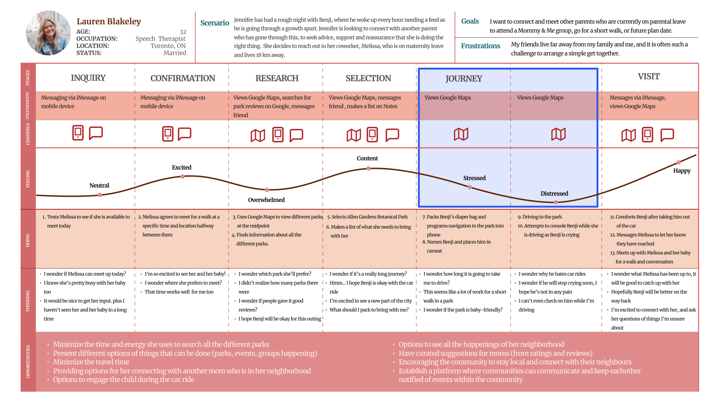
Reflecting on the Jennifer’s experience map, I found the key opportunities for intervention occurred during her journey to connecting with a friend.
I authored several user stories to address my persona’s pain points.
User Stories

Functionality-related user stories were grouped together as epics, to determine key product functions.
Core Epic: Viewing Resources Available
This epic informed the task that my persona, Jennifer, wants to accomplish.
Task: Search and book a Mommy & Me class available in the community.
Task Flow


IDEATE & PROTOTYPE
A focus on the right features…
Keeping in mind the task that my persona wanted to accomplish, I began researching and seeking inspiration from existing mobile apps for components and elements.
I looked into apps that assisted users in booking services, accommodations or flights.
Users stated they wanted a clear, simple process of attending a class.
UI Inspiration

My inspiration board informed my initial exploratory sketches.
I created sketches to determine various layouts keeping in consideration my user needs and UI specifications.
Sketches

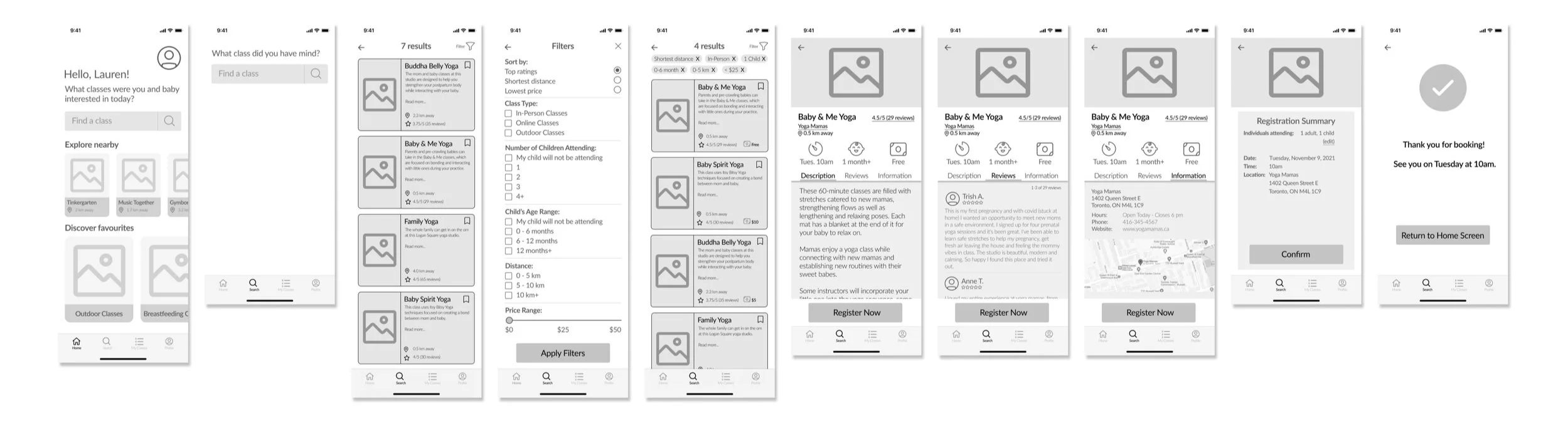
Reflecting on these concept sketches, I then converted them to digital grayscale mid-fi wireframes which served as a skeletal framework to showcase proposed components.
Mid-Fidelity Wireframes
Version 1

Pivot!
Upon further analysis, I edited several frames as I realized Frame 2 could cause confusion for users, since it appeared after clicking on the search bar.
I also consolidated the filters (Frame 4) and sorting (Frame 5) in order to reduce number of clicks, to minimize user frustration and annoyance.
As such, I created another set of wireframes (Version 2) prior to the first round of user testing.
User Testing: Round 1
Below are the main changes I implemented after the first round of user testing, and the revised wireframes (Version 3).
Version 2


TEST
Discover opportunities for iteration, uncover problems, learn about users…
User Testing
To understand the functionality and usability of my prototype and its features, I conducted two rounds of user testing. Each rounded consisted of five participants.
Following each round, I plotted a Design Prioritization Matrix, however decided to implement all the recommended design changes as they would add high value to my users and were very feasible.


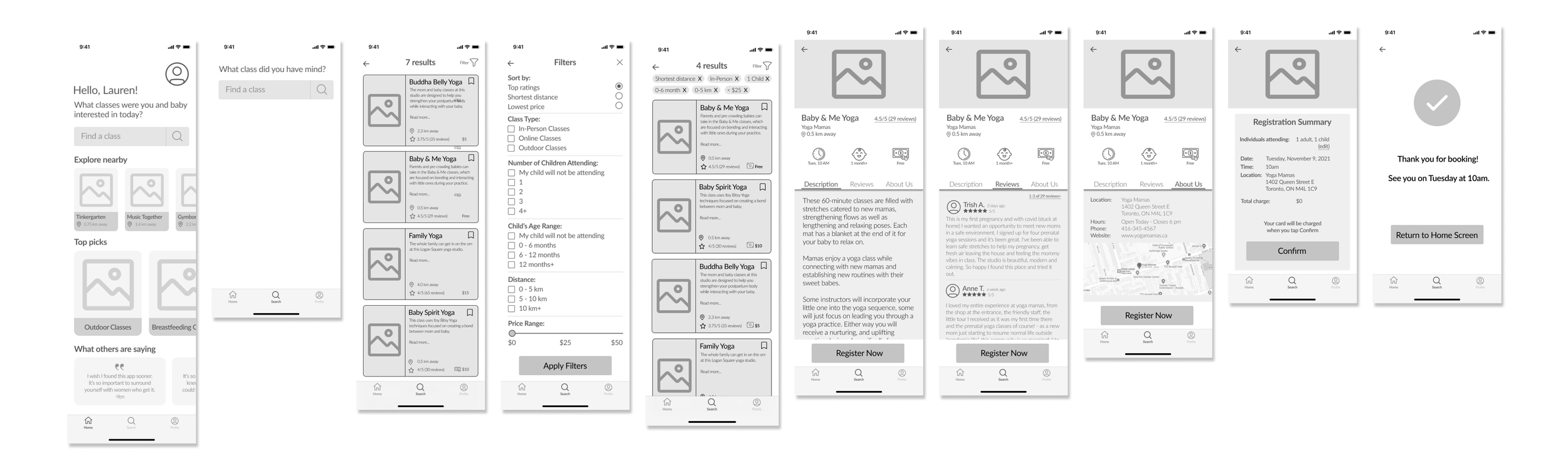
Version 3
User Testing: Round 2
Below are the main changes I implemented after the first round of user testing, and the revised wireframes (Version 4).


Version 4
The importance of mirroring my user’s aesthetic and ambience…
Reflecting on my project so far, I thought of the aesthetic and adjectives that most embodied my target audience.
My target users were young, first-time parents who were excited about forming connections with others who shared a similar, lived experience.
My target users who were millennials, would identify with adjectives such as fresh, clean, minimal, elegant and modern.
With these descriptions in mind, I collected images and photographs that fit the aesthetic and ambience I was aiming to create.
Branding

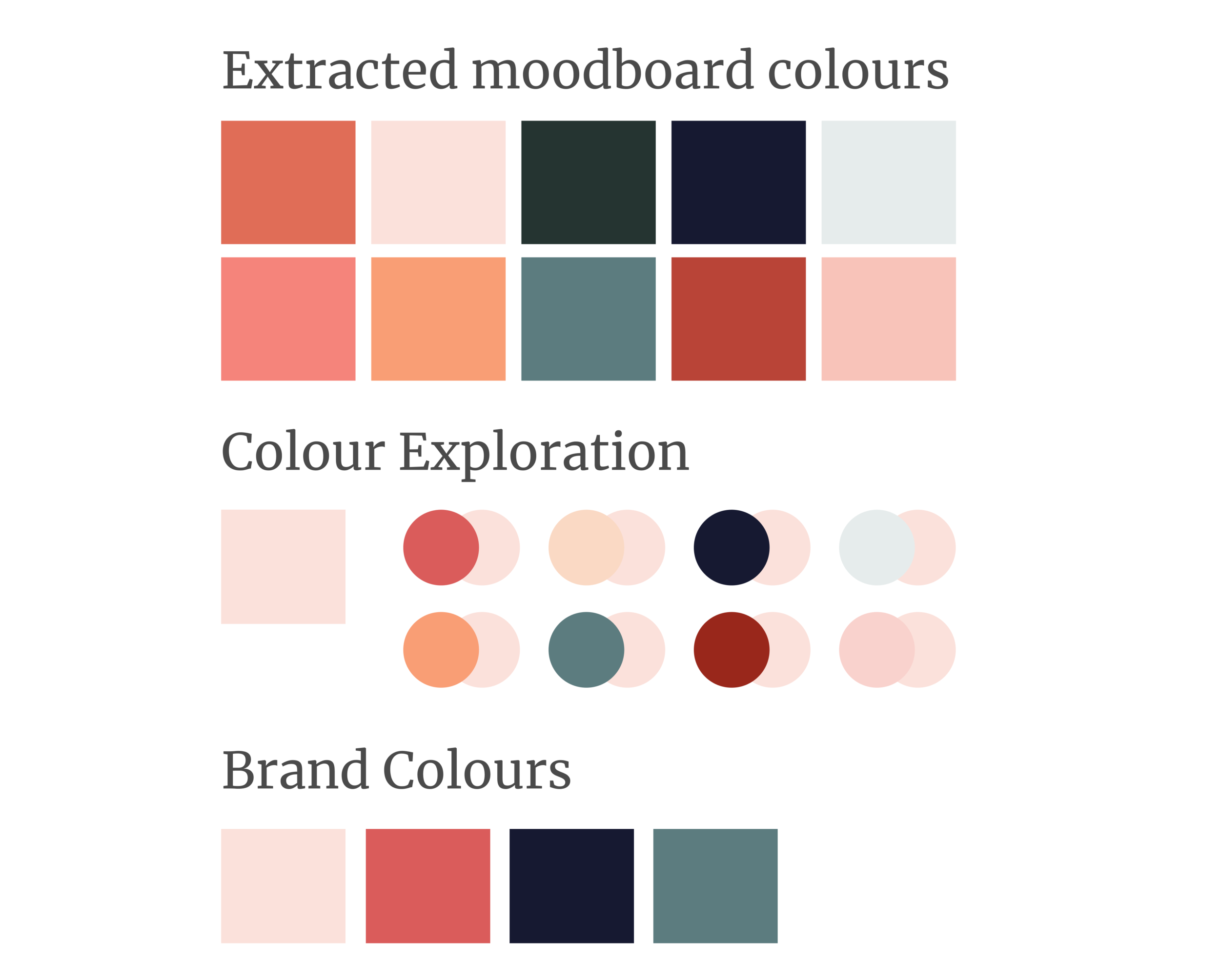
Using my moodboard, I extracted colours that were prominent.
Through my images, I noticed the palette was warmer colours, including corals and navy blues.
The colour coral fit my branding given its association with positivity and hope; warm, dynamic, and invigorating, it blends the femininity of pink with the optimism and energy of orange. It is inclusive and revitalizing.
While exploring brand names, I decided on the name “Kindred”.
Kindred is described as being of “a similar nature”, and “it takes a village to raise a child” encompasses the need of a community and support system to raise a child. “Kind” is also “child” in German.

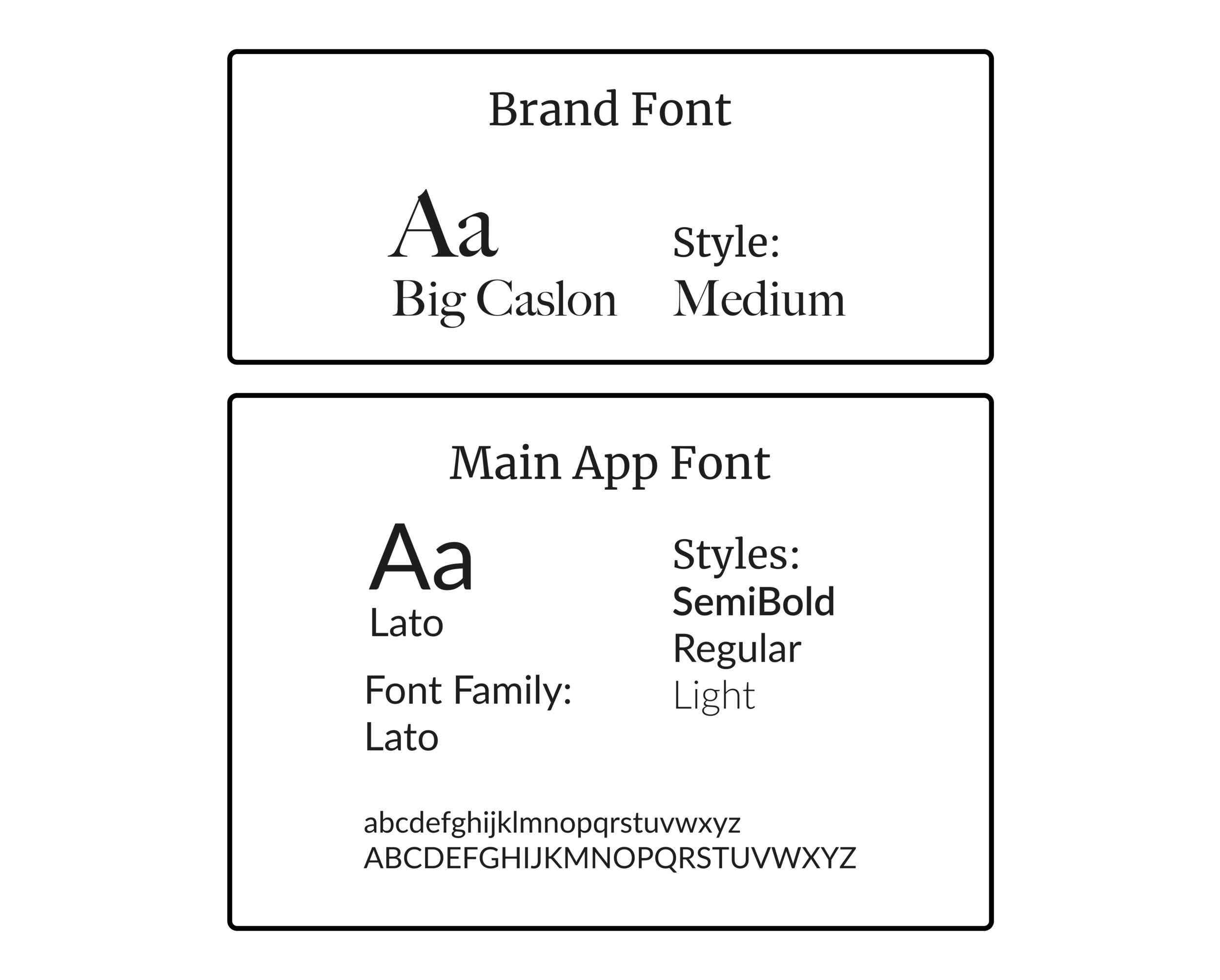
For the brand wordmark, I chose a serif font as it has a distinct characteristic and history of giving people a feeling of elegance, confidence and trustworthiness.
For the main font, I chose a san serif font, Lato, that was readable, clean and approachable.
Throughout the UI process, I ensured that accessibility was in the forefront.
I conducted accessibility checks including colour contrast checkers, colour blindness simulators, and colour pairings that passed the WCAG AA standards.

Now… All together!
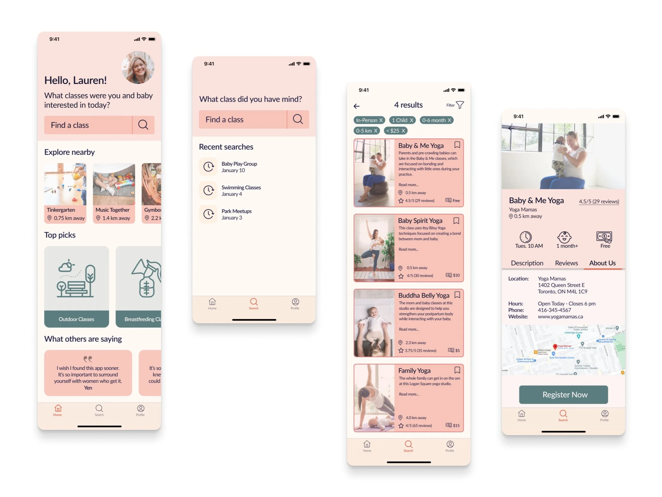
High-Fidelity Prototype

Finally, with all the visual brand identity elements established, I created a high-fidelity prototype.
I ensured that all elements worked well together to assist the user in completing their task. I also made sure that the visuals were not overwhelming, and applied accessibility considerations.
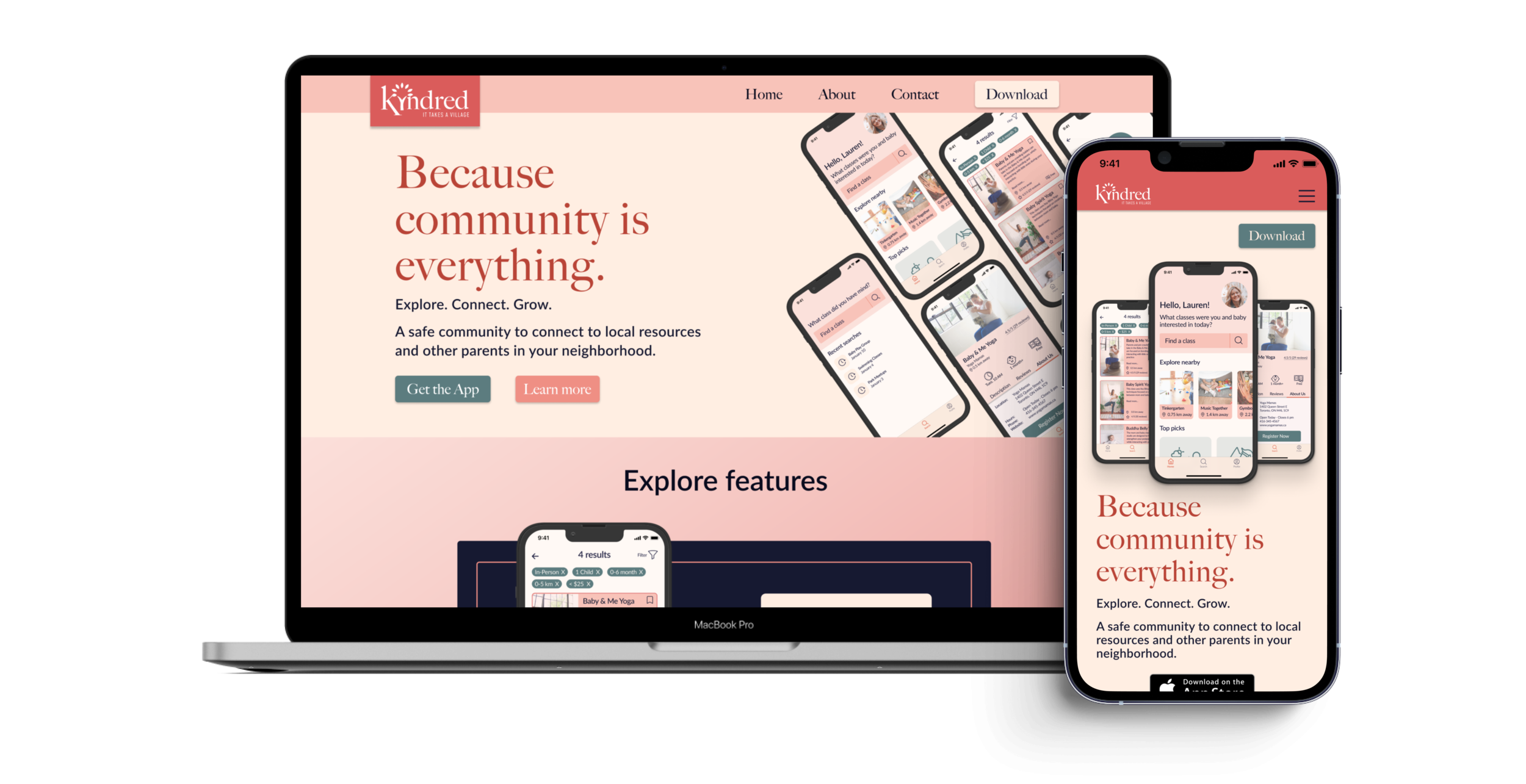
To launch Kindred in the market, I created a marketing website for desktop and mobile viewports.
While creating this website, I kept in mind that it served as a first point of contact for potential target users and needed to:
showcase what Kindred was;
demonstrate its value proposition through features;
highlight testimonials and the experiences of users;
and of course, high-contrast call to action buttons that encouraged users to download the app in their respective application stores.
Marketing Website
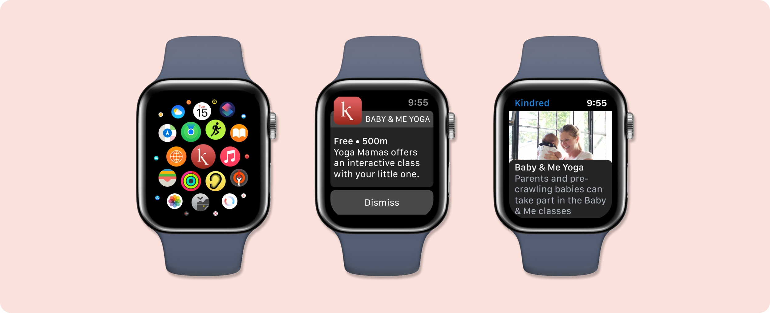
As I think long-term, our world is become more digital with the growth of Internet of Things technology.
Keeping this in mind, I would further develop Kindred to be available on wearable technology such as on Apple Watches and Fitbit watches. It would be essential to encourage parents when they are out with their child, to easily search for a class in their vicinity to further encourage social connection and fostering the value of community.
Future Thinking
Design is not a linear process.
It’s messy, it evolves, there’s multiple iterations, and it’s okay. Acknowledging pivots adds considerable value to a project.
Users are real-life people with real-life problems to solve.
I, as the UX designer, am not the user. It is crucial to continuously speak to users, understand their needs and pain points, then test, iterate, repeat.
Effective design is not just pretty.
It is accessible, useable, predictable (in the best way).